Wednesday, June 8, 2011

Week 11

Assignment 3 Narritive.

After feeling a bit disheatened towards my final result i went out and did a bit more shooting.
I went to victor harbour recently and a shot I took of the trees bluring past the car i loved.
I revisited it a few weeks later and found that although there was no way of putting the wolfman in the image- i didnt think i needed it. It has that narritive too it that i was searching for aswell. Its as if the wolfman is running though the trees on the full moon and this is his view. Although the perspective of the shot is diferent from the others where you can see the character i think it fits well together as a series. It makes you ask where hes running.

Image 4: Assignment 3

I also revisited my spider image and touched up the final image. Im happy with it although the final was different to what i had imagined it as. i tried my best to get the shadows 100% but i know it could be better.


I changed my final image for this assignment as well. I wanted to go with the predator in the background of a family portrait but i felt like all my images were too dark and i wanted to work with something fun. Still keeping with the figurines i found a Mario figurine and an image of the water I down by the lake i had shot that week. I though about how i could use them together and came up with the idea of  Mario being in the real world. I  aranged the image so marios feet are on the moss and leaves while his face is reflected in the water. I thought it would be a good shot because in movies characters always do that when they are qustioning themsleves or going through a tough time. However mario's a character thats always portayed as happy and excited, which gave the image a narritive . Why was mario looking at his reflection, why is he questioning himself, why his he showing these emotions when he is normaly so happy. The only awnser i though of myself was because his stuck in this real world and hes curious about the way he looks and why he doesnt quite fit here. Its a great idea i think that could be followed by and entire series. Mario on the sydney harbour bridge, mario in the city, mario catching a bus - everyday things that we do with mario stuck in the middle of them.


Assignment 2: Image 2


Original Image shot - had to crop bottom and clone water to fit marios face in.

Sunday, May 29, 2011

Week Ten

German Etching Paper - creates velvet blacks
A4-Shiny paper $2
Frame with  line around image
Rag cotton paper - $90 square meter
inkjet paper obsorbs ink - dye
German etching paper - ink sits on top - easily smudged - pigment on top of paper
Series of images can be displayed in box
can do framing courses - to exhibit
space between glass and frame - adds different feel to image
neutral frames
Websites - domain central
Luke simon - wedding commerical
Dave Evans
Sharpen before print open one at 50% and another at 100%
Smart Sharpen - sharpen what needs to be sharpened
"hallos" eg plants flowers
 black frame next to white boarder adds balances out feel to the image not to dark not to white
sharpen to the point where the image starts to lose itself
cant sharpen images that are out of focus
look at all areas of image- no dust spots

After working on my final Narririve and finishing four of the five images:

I found that i liked the older style alot, I made my subject wear a shirt, i stuck a freaky old lampshade in our room to create that old feel. while at the same times i worked with high shadows like the remade film for the images to look modern in black and white. The first image I used the old horror font and duplicated the layer to give it a large drop shadow, and left the background and lighting reasonalbly simple to side with and orginal poster. I tried posterizing the image to create that high contrast flat image that alot of the poster have but i found that it didnt look to good with the other images as a series. I decided to keep them all the same so they all look as real as they possibly can while still looking old with the black and white. Ive use two images before the change and two images after the change. Using inspiration from Harry Potter and the Prisoner of Azkaban i wanted to reflect the change with the blood shot eye and small pupils. In harry potter the werewolfs pupil grows larger and I tried that within my image, as well as an oval shaped pupil but it didnt quite look right so  went with a small pupil.
        
 
Harry Potter Werewolf - Large Pupil

     Example Werewolfs Eye

Eye that I started - Oval shaped.

Given more time, I would most likly chnage some of my images - i dont feel like the last two images convey a narritive very much, I would make scratches on trees or include a girl witin in the images. I feel like the last image looks good as a shot but the wolfman isnt doing anything interesting it doesnt make you ask whats happening in the image as much as id like it too.


Week Nine

 Work in progress review.
 Narritive Assignment so far:

Image 1

Image 2

Image 3

Image 5


RESEARCH
- since im creating a series that is based around a movie and one of the images is losely a poster i wanted to reasearch some posters as artworks.

Moulin Rouge: La Goule
Henri de Toulouse Lautrec
Planographic Four colour brush and spatter lithograph in four colours on three sheets
image 191.0 h x 117.0 w cm 
1891

- Paris streets 1891
- Henri De Toulouse -most well known work
- De Toulose depicted the performers in his work rather than the venue; which was the most common method at the time
- favourite subjects- Louise Webber / stage name La Goule - known for rash and outgoing behaviour, revealing hem lines, wearing no underwear
- De Toulouse captured this but her vulnerability as a woman - with careful facial expressions
- Other man in poster is her partnerValentin le Désossé - boney figure
- uses simplified lines for create image
- De Toulouse - most well known poster artist with Moulin Rouge the most iconic 


Sunday, May 15, 2011

Week Eight

Finished Assignment 1

1. Image saved as Full Size TIFF, Adobe RGB (use building image)

2. Image saved as JPEG for web, sRGB profile, 500pixels wide, 50kb in size (use building image)

3 & 4. Image saved as a layered TIFF, guy on one layer, background, with layer mask.

5. Image of girl, B&W, blown to white, Square crop, eyes on a 1/3 line, spot out sensor dust.

6. Moth image, Crop to square, 4 x images, black background

7. Change colour of spidermen to green.

8. Clone out other cars.

9. Square and border, size for print, colour profile AdobeRGB.

10. A4 print on A3 paper, colour profile AdobeRGB.


Image 8


Image 9

Image 10

Assignment 1
So far - Still more to goo, need to edit the legs, they look a little clumsy, bring it all together - spider still looks ut of place, lighting and sky.


RESEARCH
- Watched:
- The Wolf Man (2010)
- The Wolfman (1941)


-Directed by George Waggner the Orignal Movie seems alot more light hearted because of the time in which it was made.
- IMDB - describes the plot as "A practical man returns to his homeland, is attacked by a creature of folklore, and infected with a horrific disease his disciplined mind tells him can not possibly exist."
- Both films are relivialy similar in plot and true to each other
- The orginal was the first film to introduce the characters in the film since The Black Cat (1934)
- love the way the blacks in the first film are quite grey and in the remake they are very dark black scenes.
-Along with frankenstein and dracula the wolf man is one of the most famous horror characters of all time
- Other werewold films that acompany the Wolf Man are they Howiling and American Werewolf in London


- Werewolves are alson know as lycanthrope - the film Underworld uses this term in which the werewolves are called lycans who battle against the vamps!
-mythical or foaklore creature who shapeshifts by being bitten by another wolf or a curse.
- transformation coinsides with the months cycle of the full moon
- most popularly noted by Gervase of Tilbury and earlier amongs greek writings of Petronius
- posseses super strength and senses, vunlerable to silver bullets
-European monster
- Herodotus in 'Histories' - was written that a tribe were all transformed in to wolves once every year for a couple of days
- Greek geographer Pausanius - story of the lycan- transformation into wolf because killed a child.
- Apollodorus + Ovid - give human flesh to Zeus and transforms into lycan as punishment for his murder

- still featured today in modern literature - Harry Potter and the Prizoner of Azkaban.


I dont want my work to look like either one movie or the other; I like they greys and the old sytle to the original, but the remake CGI look so real at the same time. I think the figuirne will give an orginal movie feel to the images because the wolf is a fake and obviously not reall but at the same time I'd like my images to be dark with high shadows and have a sence of reality. However my first image I'd like to be aimed more towards the original movie in terms of the text and layout- I want that old style horror text and for it to be quite simple not to complex so it doesnt take away from the feel of how the old horror posters used to be. The following images I hope for them to look more like newer images but I plan to keep them all in black and white - to get a larger tonal range and the ability to creat more shadows - in turn keeping with the the orginial movie which is black and white unlike the remake.

Monday, April 4, 2011

Week Six

This week was on Assignment 1


Part 5 = Image of girl, B&W, blown to white, Square crop, eyes on a 1/3 line, spot out sensor dust.


Part 6 = Moth image, Crop to square, 4 x images, black background                                     


Part 7 = Change colour of spidermen to green

Assignment 2
Image 1
I want to use a house across the road that I look at everyday. I like it because it has a subtle gothic feel with black and white furnishings and floral iron gates and door frames. I'd like to use a giant collectible figurine of a spider and edit it on to the top of the house.

Image 2

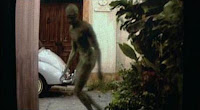
I like the idea of traditional family portraits and keeping with the theme of fear and creatures I'd like to edit it a figurine of Predator either as part of the family or walking past in the background as if the photographer happened to catch it in the serene family moment.

Assignment 3
The concept of a narrative kind of scared me because I was afraid I wouldnt be able to come up with an interesting enough story. While looking at the figurines for my other assignment I saw a large Wolf Man figurine, and I thought why i cant use some one Elise's story. Since I love reading and watching movies, and find classic monster stories really interesting, I'm really looking forward to creating it into a photographic series.

Image 1
ARTIST WHO WORK WITH SPIDERS:
After looking into artists who work with spiders i found there is a lot of ways in which you can document something - some can be very artistic where there is a lot of focus on the pose of the insect/spider , the eyes and legs. Other photographs are scientific documentations of a species showing the whole body of an insect. Another type is somewhere in the middle - images that can be used for licenced representation  eg magazines for nature, or gardening. They are a stock pile of images for companies to use that are informative yet visually interesting.

Photographers such as M Plonsky, Alex Wild, Frank Philips, Dennis Crawford, Steve Gsuchmeisser.


A lot of which use Marco and SEM - Scanning Electron Microscope to magnify the specimen by a million in order to get a detailed image.

Dennis Crawford - has his own company titled "Graphic Science" - specialist in insect Photography. he sees it as a insect image library that companies can come to and use.

Because spiders are feared and scary this is defiantly something I'd like to convey - however with experimentation I need to decide if its best to have the spider in a background as if it were a cheerful image (blue skies sunny day) which would be unexpected or to change the lighting and have clouds and a dark and eerie atmosphere.

I also worry that because the subject isn't actually real - it might take away from the image - but on the other hand it also could add to the image - so long as it looks like its meant to be there. the crispness of the digital picture might contrast against the figurines plastic appearance.

The spider figurine i plan to use is based on the spider from Lord of the Rings - Shelob. The spider in this movie is greatly fear and id liek to recreate that in my image.

An artist who's work I really loved is Adrian Markis who has a series called Invasion which consists of city scape's and giant animals taking over the city. Really photoshoped pieces, and you cant take your eyes of them - i felt it related to the task we have at the moment - making something unbelievably real.


Image 2
Using a traditional family portrait of my family, Id like to put a Predator in the background. Having the portrait outside the house allows for the predator to sneak past. What spurred my inspiration for this piece, was the movie signs, how the aliens move without your knowledge, how they sneak around and you wouldn't even know - which is what i found most scary about that movie.


Assignment 3 - The Wolf Man

After researching on the Internet  Isaw some of the original posters for the movie and found that i really liked them. The first image of the five i hope to create a grainy posterized poster for the wolf man - something that doesnt look modern- today everything is so clean and crisp making something look like its from the 40s will be an exciting task.


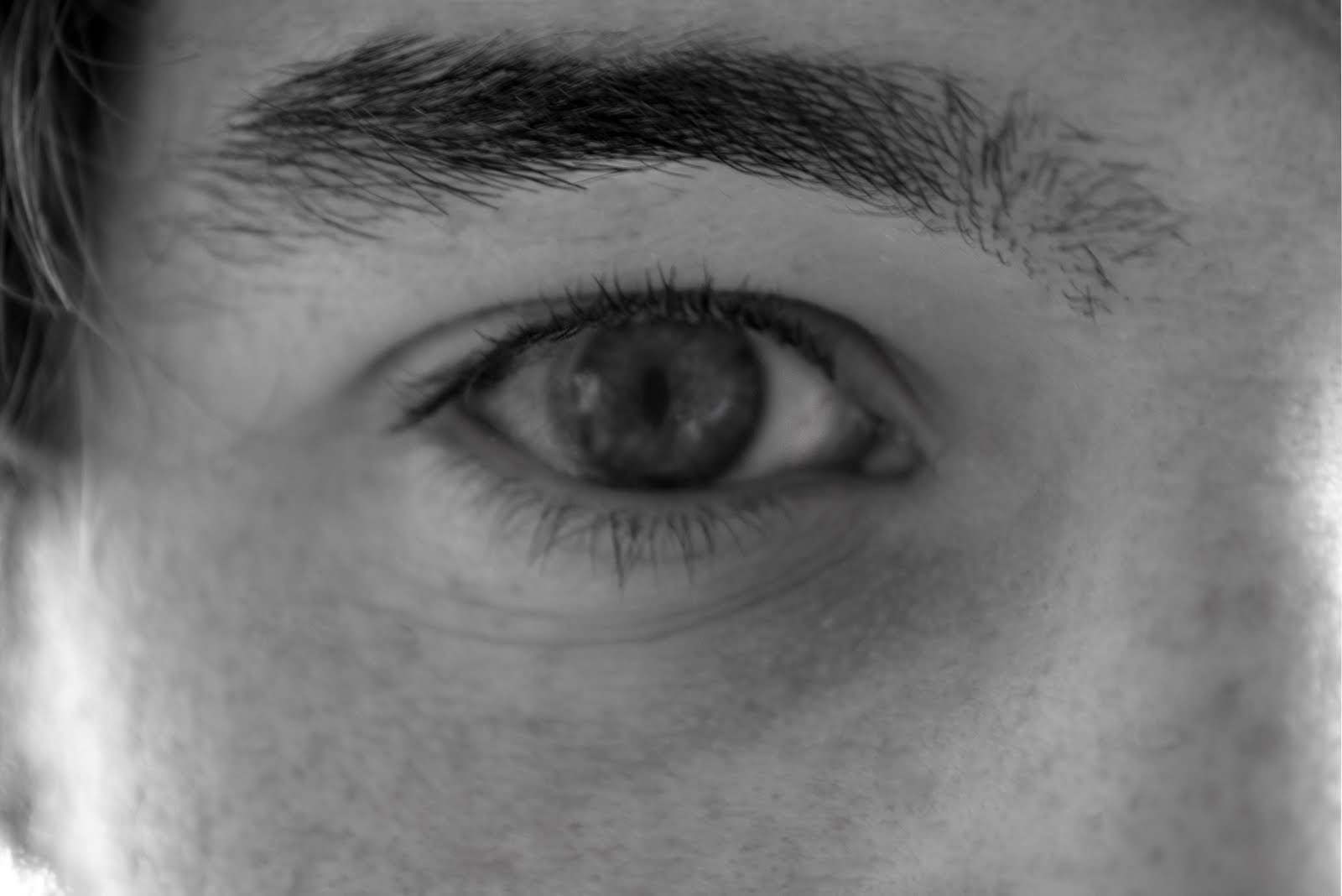
However I have a few key ideas for frames - to convey that the man is turning - show an eye bulging red, irises dilated. eerie feeling. i found that even in movies such as harry potter this is a typical shot of how they convey the change from one form to another.

I'd like to take some shots of the full moon which is next on April 18th. and use the brightness to create a silhouette of the wolf man - either on his own of attacking a female. Which Ive noticed- the wolf man is always sort of carrying a beautiful woman and he attacks her. this i think would be a key frame in the series.

I think next I should watch the movies and read some books about the story to get a correct background knowledge and then see what i come up with next.

Monday, March 28, 2011

Week Five

Scanning!
-drum scanner- top of the line scanner
-flat bed scanner
-lights and lenses on the base and top
- if not touching the glass out of focus
- film uses a different lens, focuses on a different point
- size up to a3 or a3 but are worth a lot
- when scanning film emulsion side down, shiny side up
- plastic film holder
- epson scan - unisa
-professional mode
-most have adjustibility
-negatives are not reflective
- doc type= film and film holder
-blk and white neg / colour
- wait for scanner lights to be correct temp
-preview
- crop how much needed
- adjustments - histogram, pull black and white markers
- picture faulty - light let in = tell it where the light is to correct the light without losing image (face)
-thumb nail unclicked - loses edge
-film has a cast - in colour
- Resolution - only to its optical limit
- optical limit is 240
-eg 9600 dpi divided by 240 = 40 inch print/ 100 m /1meter
- keep at original size in order to stop computer from filing in pixels
-clean negatives to avoid dust spots
- fog -dodge and burn in shad, high, mid tones
- 255 pure white in R,G, B
-match hardness with hardness of edge - photoshop
- hair - drop opacity
 - layer mask doesn't delete, lets you hide  - paint brush white more black erase
- larger the file the bigger the radius should be - no more that 2

Monday, March 21, 2011

Week Four

This week was an introduction to Photoshop and Cameras.

Camera notes:
- Nikon D 90 middle range DSLR
-other newer cameras have better water proofing megapixels and more buttons
- zoom lenses, more glass, not as good as a prime lens
- zoom lens eg 18-200mm huge range, yet Prime lenses produce a better image
- zoom lenses can go 2-3 stops bellow lens length before shaking
-constant and single focus, constant always focus eg sports children moving things
- CHECK, Iso, white balance,quality, and metering
- auto white balance is good, unless different lighting - raw change white balance
-metering - Spot metering 5% of image used for checking exposure of small areas
- centre metering -  portraits used when colours or light in the background is distracting
- full/matrix metering - picks best exposure
-firmware - software inside the computer
- Websites to see - digital discoun photography, photographic wholesalers
- SRGB = Screen colours
- Adobe RGB :) people can adjust for you - who are trained ect
- CMYK files are crap! and will print crap.

Photoshop- things I learnt that I didnt already know
- Ruler tool - adjust horizons, helps with layouts
-colour value numbers
-can use RGB as black and white better tones
-adjust levels to widen tones - black & white
-unsharp mask (darkroom) 2 layes one blur on sharp
- smart sharp - eg sky doesnt need to sharpen
- use blur to soften skin

Assignment 1

Image 1- Save as 500pxl jpeg for web 50kb
Image 2 - Tiff, full res Adobe RGB


Image 1 above.
(Image 2 is the same - to big to upload)


** will start looking at artists who use narritive ect for Assignment 1 and 2